British Paralympic Association
Major donor recruitment materials
Initially, we were brought in by our close collaborator, Lisa Pember, to create the visual identity and launch materials for The Parallel Club; a giving club for major donors. The client loved what we did together, saying it set new standards for how the BPA represented itself. Subsequently, we were also asked to develop a case for support for high net worth supporters and prospects.
What we did
Project management, sub-brand identity and roll-out, design, print and production
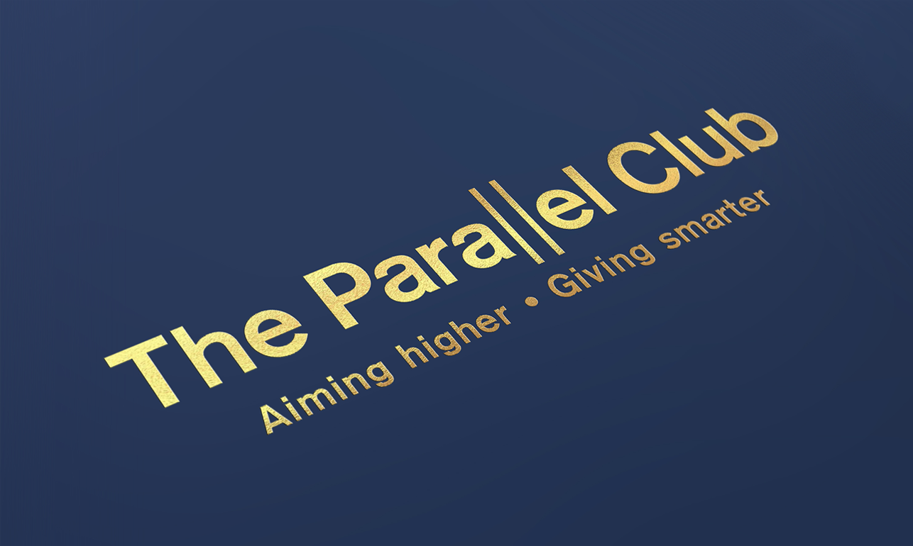
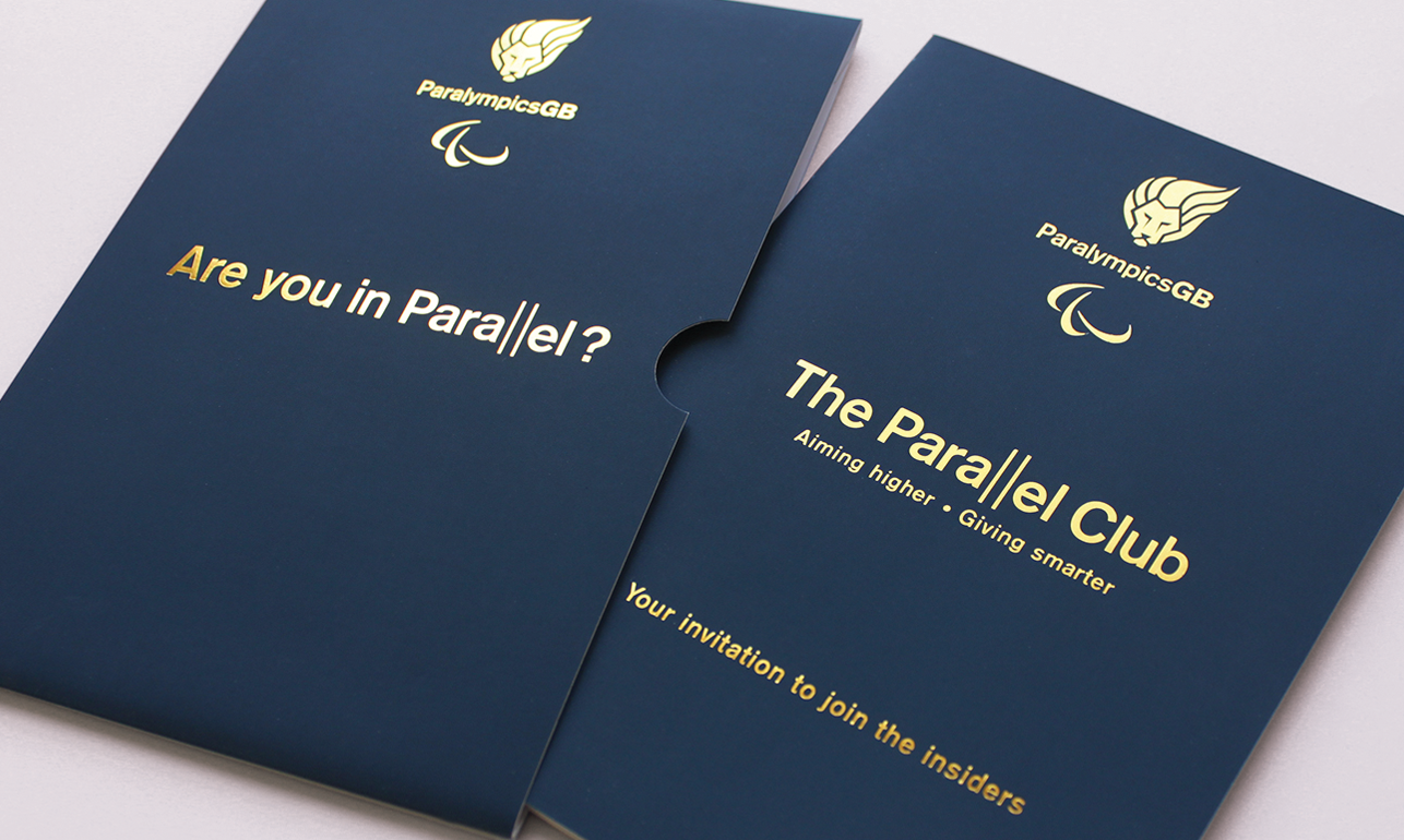
The Parallel Club
Our ambition for The Parallel Club materials was that they embody ‘high end’ – from the quality of thought, through every stage of the design and production process. For example, we paid special attention to paper stock and checked proofs at every stage to ensure the colours sang off the page. The result is simple but sophisticated – with smart touches, such as the treatment of the parallel ‘ll’ in the logo.
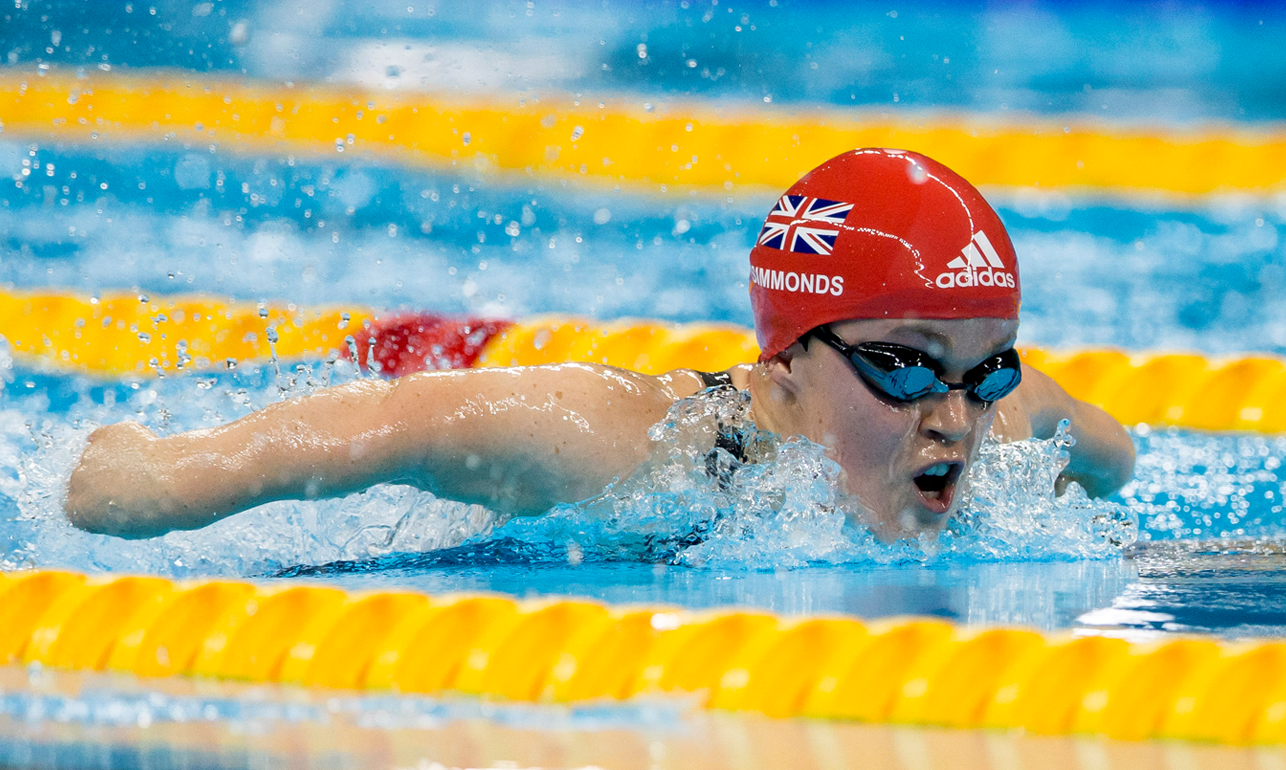
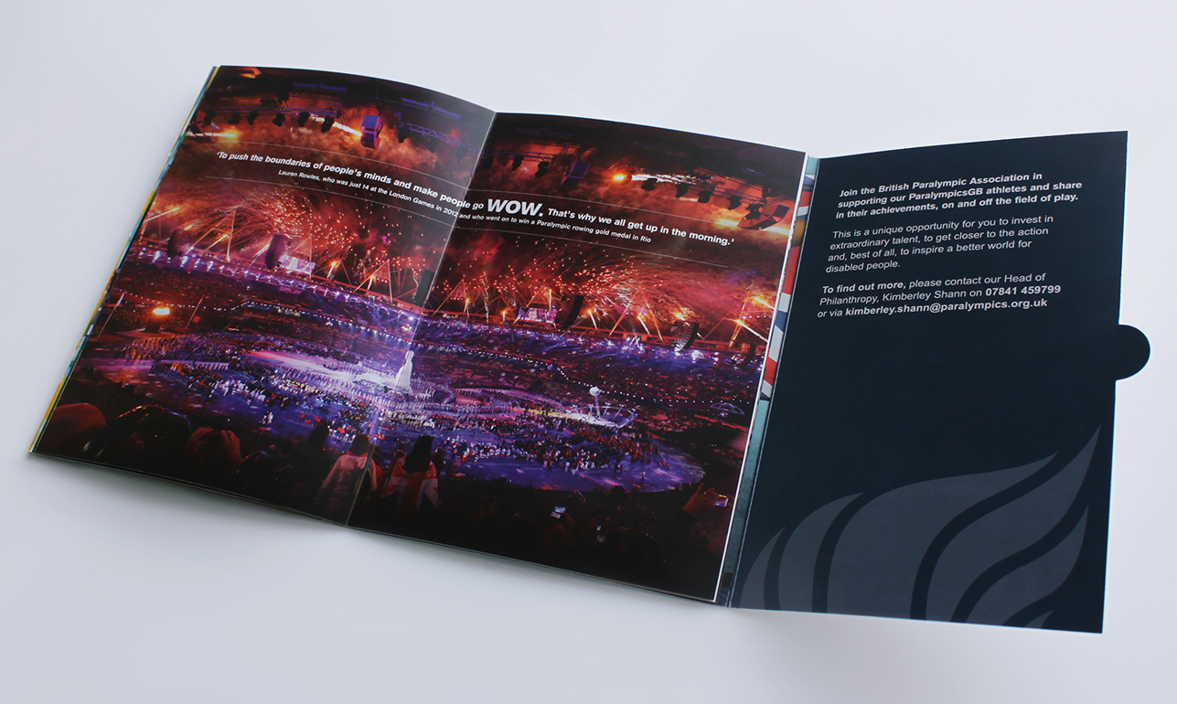

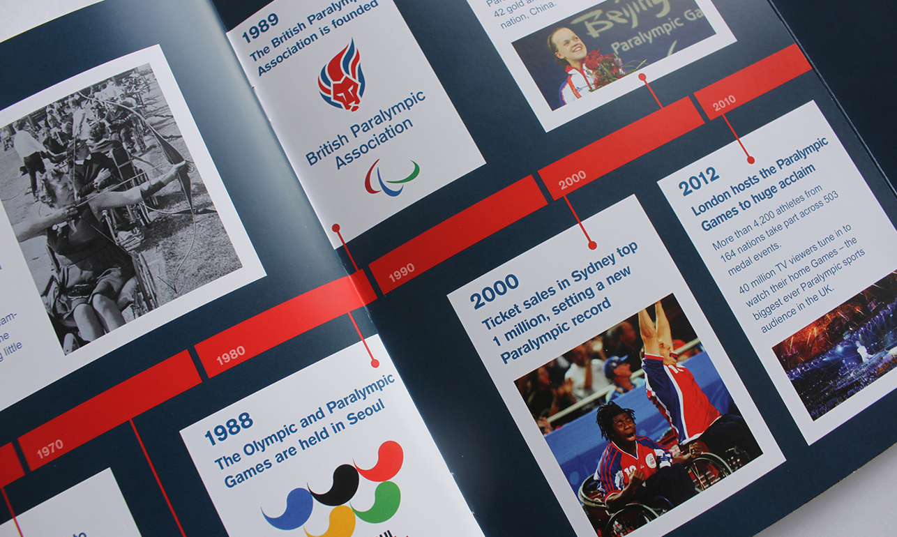
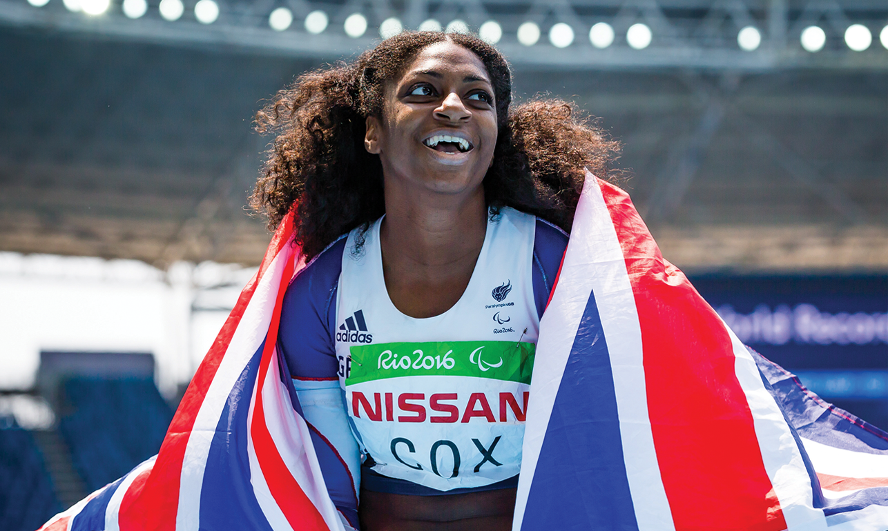
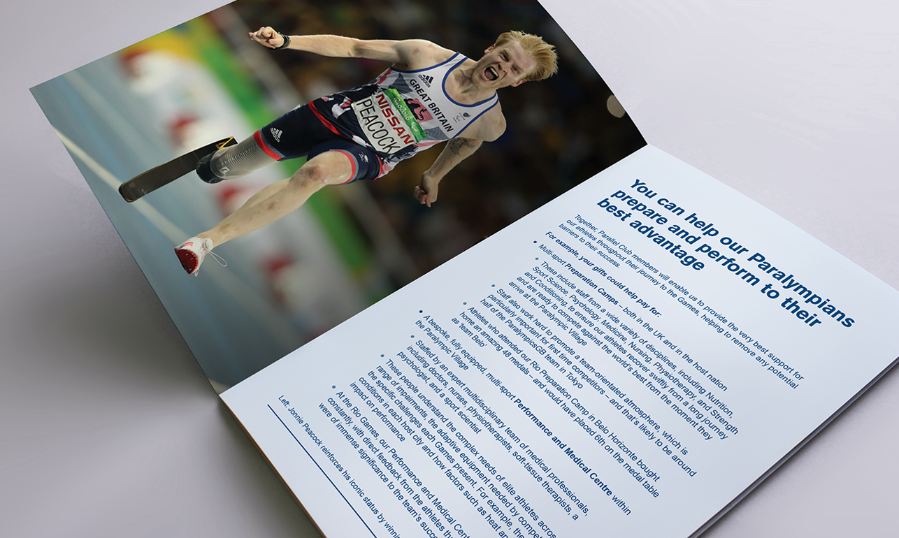
The case for support brochure
In this case for support brochure, we leveraged the red, white and blue colour palette to enhance the ‘best of British’ feel, allowing the BPA lion to take centre stage on a plain white background. We paid particular attention to image selection, both to reflect diversity and to ensure that each picture celebrated the athletes and their achievements in a vivid and compelling way. We also went above and beyond to source timeline photographs that didn’t just match their point in history but also worked to build a story of the organisation and how it had developed over the years; something that’s typical of our attention to detail.